Chances are that if you have had even a passing interest in golf’s major championships in the past few years, then you know Lee Wybranski -- or at least know his work.
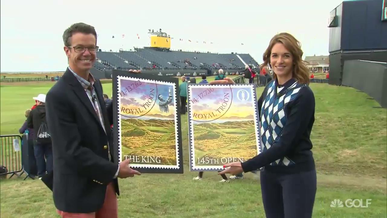
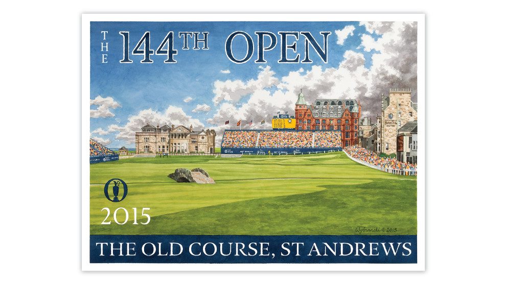
The Flagstaff, Ariz.-based artist has created some unique, timeless and very popular pieces based on major venues including recent events like the PGA Championship at Baltusrol, the Ryder Cup at Hazeltine and the Open Championship at Royal Troon.
“My goal is to identify what I think are the key elements of the venue and find a composition that includes all of them in a striking view,” he said.
Wybranski has a bunch of great projects in the works, including poster designs for the 2017 U.S. Open at Erin Hills and the 2017 PGA at Quail Hollow. He is also working on art for the Walker Cup at Los Angeles Country Club and the 115th Western Am at Skokie Country Club.
I caught up with him recently to chat about his passion, creative process, influences, and bucket list.

JL: Talk a little bit about your background as both an artist and a golfer. Where did your passion come from? Where did you get your art training?
LW: I was one of those kids who were always drawing, first superheroes then athletes and rock musicians. I went to 12 years of parochial school with some art history but very little art training. When it came time for college, I decided to pursue my passion and got my BFA from Syracuse University.
Art actually brought me to golf – which is not what most people expect to hear. My first drawings I did in golf were clubhouse portraits, and my first client was Winged Foot, and this opened a lot of doors. Within a year I had done work for Saucon Valley, Ridgewood, Caves Valley and National Golf Links. I started to play in my 20s because I was receiving invitations to play these amazing places and I hate to miss out on a perk. Also I thought it would inform the artwork if I played the game enough to really understand it. I gave it a try and was quickly hooked.
JL: Your major championship posters have become almost synonymous with the events themselves. Describe the creative process you go through when visualizing and creating them.
LW: I visit the site about 9-12 months in advance of the event and spend two days on site with a camera and sketchbook. My goal is to identify what I think are the key elements of the venue and find a composition that includes all of them in a striking view. A recent favorite and good example is the 2015 U.S. Open poster – at Chambers Bay we had the train, the Puget Sound, the Olympic Mountains along with the dramatic design and bunkering of the golf course. The goal is to fit everything into the poster in a composition that looks timeless and simple.
I often look into the history of the venue for ideas but rarely do I include historical content as the posters are intended to celebrate current major championships. For smaller, less commercial events, such as the 2017 Walker Cup or Western Am, we may include historical figures. My 2012 poster for the Western Am at Exmoor featured a stylized Chandler Egan in the foreground, as Egan was an early member at Exmoor and an accomplished amateur.
JL: How long does a typical major poster take to create?
LW: The process generally takes 6-9 months. The paintings themselves take 3-4 weeks of steady work in the studio.
JL: Who are your influences? Favorite artist?
LW: Some direct influences that you can see in my work are the posters of the 1920s and '30s, both the U.S. (National Park and WPA) and European (British Rail and French and Italian travel) traditions. Fine artists who show up in my work include Edward Hopper and Winslow Homer. Couldn’t pick a favorite artist, but Picasso cast a long shadow in my formative years, largely because he was so inventive and prolific.
JL: What are some of the major differences between creating a poster for a major and much of the other work you do, such as logos, branding work?
LW: I typically get some freedom with my poster work – for example, a client will generally go with my recommended subject/view. The logo and branding work that we do is a very different animal… we do a lot more listening to the client and tailoring imagery to suit the culture/identity of the facility or event. While the logo design work is very creative, it is an applied art so how well it suits and serves the client is the principle measure of our success.
JL: Bucket list courses to play or to paint?
LW: Cypress Point, Bandon Dunes, Machrihanish, Eastward Ho!, Maidstone, Royal Melbourne.
JL: What is your favorite medium?
LW: I work mainly with watercolor because it dries fast and is most familiar. Since I spent the first 15 years of my young artistic “career” drawing, I feel an affinity to working on paper. I also like watercolor because it is a very old and natural medium and because it allows for what I call “happy accidents” when wet paint meets another color and they merge in a way that you cannot quite control.
JL: Any new projects in the works?
LW: We are launching a series of golf travel posters this spring and the first will showcase Phoenix and Scottsdale. And, we just released a joint poster project with Goat Hill and I’m looking forward to seeing how that goes this season.
JL: Who are your favorite players to watch?
LW: (Henrik) Stenson, (Phil) Mickelson, (Brandt) Snedeker, (Hideki) Matsuyama, Justin Rose, Sergio (Garcia). And of course I will always watch Tiger! I like the ones who show a bit of emotion, give a good interview and/or look like they are having fun.
JL: Dream foursome and where are you teeing it up?
LW: Tough question – never thought about it! Off the cuff, Bob Jones, Bing Crosby and Bill Murray at Cypress Point.
JL: What’s the state of your game these days?
LW: With young kids at home, my game is currently in hibernation, so it’s fair to say all aspects of the game are a bit of a struggle right now – but only when I’m keeping score. I love to practice and when I do, my game cleans up OK. As a skinny guy who works with my hands, I’ve always had an affinity for the short game.
To learn more about Lee, his work, or to order prints, visit leewybranski.com

